A two-week speculative exploration of OJOS's Fall/Winter "Burrow" collection, reimagining the Korean brand's visual identity through a first-come-first-served pop-up campaign. Rather than working within OJOS's existing branding, I designed an original logo mark and built out a full asset system around it, posters, print materials, hang tags, and bandaid-style product stickers, to explore how a cohesive identity could carry across both campaign and product touchpoints. The project let me push into logo design specifically, translating "Burrow's" soft, textural, cocooned mood into a mark and system that felt intentional at every scale.
TYPE
TYPE
TYPE
Speculative Logo & Brand Design
Individual
Illustrator + Photoshop
Summer 2026, 2 Weeks
TEAM
TOOLS
DURATION


LOGO SYMBOL DESIGN
The symbol encapsulates the brand's entrance to "Burrow", where the body of the design curls inwards focusing on warmth in intimate spaces paired with the muted blue which shows up throughout the campaign. A connection between two things.
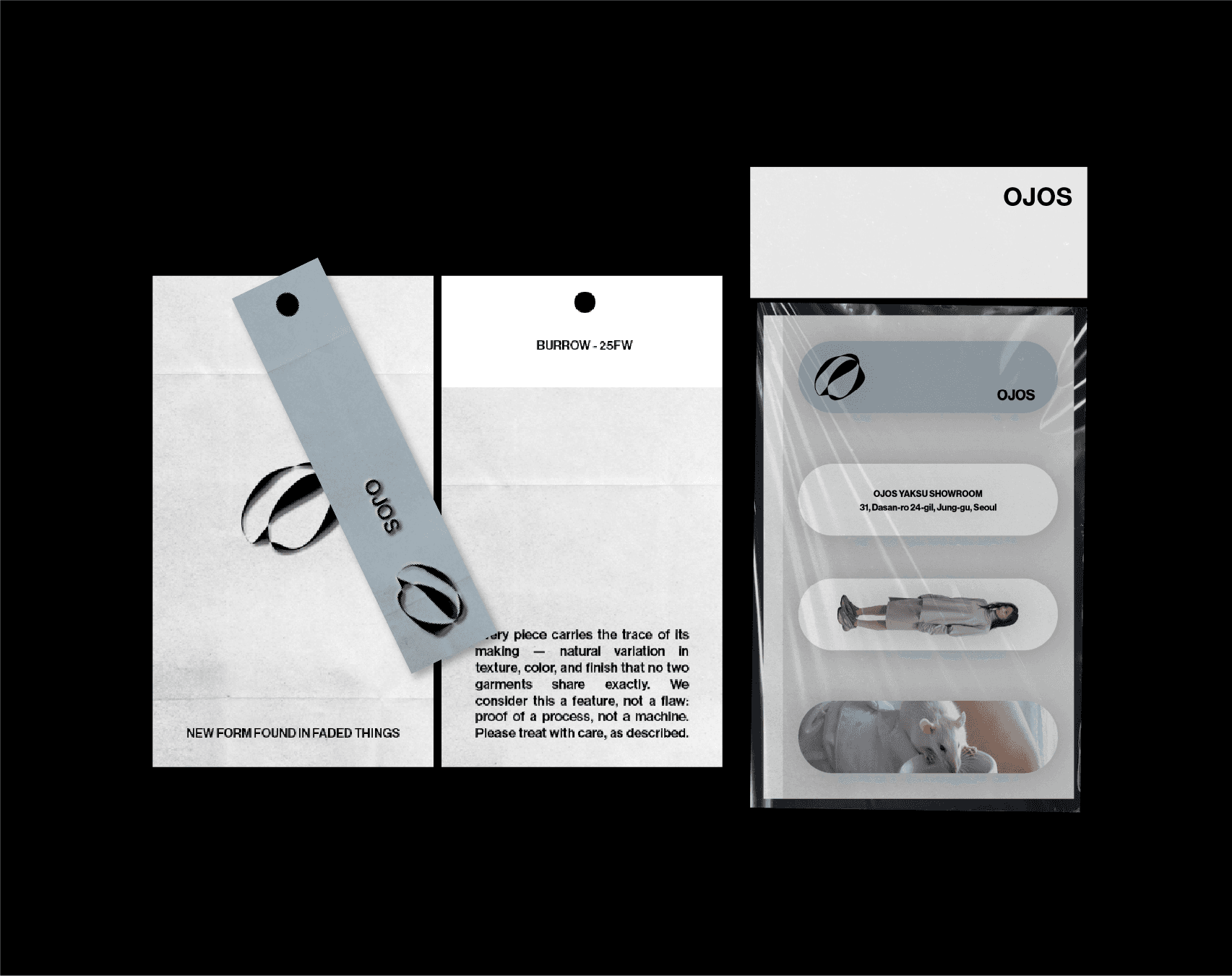


PHYSICAL DESIGN
PROCESS
Hang tag, bandaid, and print booklet are physical extensions of the OJOS identity built to carry "Burrow's" concept beyond the campaign visuals and into the in-store experience. The hang tag, in the grey-blue echoes the collection's muted palette, bringing the OJOS mark down to the smallest touchpoint a customer can hold. The bandaid, following the Korean retail tradition of gifting branded tokens past a spend threshold, reframes a small protective object as a gesture of shelter, something soothing to take home. The print booklet extends that same intimacy into a tactile object customers can flip through in person, slowing the shopping experience down to match the collection's mood of retreat and self-care.


